App Design Process: What Makes an App Effective?
Effective app design helps a person complete the task they came for, understand what happens next and recover when something goes wrong. A useful app design process connects user research, clear flows, accessible screens and prototype testing before development. For a small product team, start with one important journey and prove that it works before polishing every screen.
Updated
What app design needs to solve
App design covers how a product works as well as how it looks. User interface design, or UI, concerns the screens, controls, typography and visual states people interact with. User experience, or UX, includes the wider journey: whether the product solves the right problem, gives useful feedback and fits the situation in which someone uses it.
A polished booking screen can still create a poor experience if it loses the selected appointment when someone signs in. Nielsen Norman Group’s explanation of user experience and its relationship to UI is a useful starting point. Assess the whole task, rather than approving a collection of attractive screens.
If your team already has a working app, begin with one troublesome flow rather than a full visual redesign. Separate a missing product capability from a presentation problem: changing the colour of an unavailable booking slot will not fix incorrect availability. Choose the smallest prototype that can answer the question. The product owner and developer can then agree whether the change affects only the interface or also the rules and integrations behind it.
Mobile and web design: plan for the context
A phone, tablet and desktop can support the same task without using an identical layout. Consider touch and keyboard input, interrupted sessions, device permissions and available space. A field employee checking a job on a phone has different constraints from an administrator reviewing many jobs at a desk.
Use reference canvases to start a prototype, not to define its limits. For example, 390 CSS pixels for a phone layout and 1440 for a desktop layout can be working references. They are illustrative test sizes, not universal device standards. Resize between them and use actual target devices; do not design only for a fixed pair of screen resolutions.
Follow Apple’s adaptive-layout guidance for native Apple interfaces. For web interfaces, include the narrow-width and zoom scenarios described in WCAG’s reflow guidance, including its 320-CSS-pixel width criterion and applicable exceptions. Content should remain readable and controls usable when space or text size changes.
A five-stage app design process
These stages organise the decisions a team needs to make. They are a working sequence, with feedback between stages, rather than a requirement to finish a large specification before testing anything.
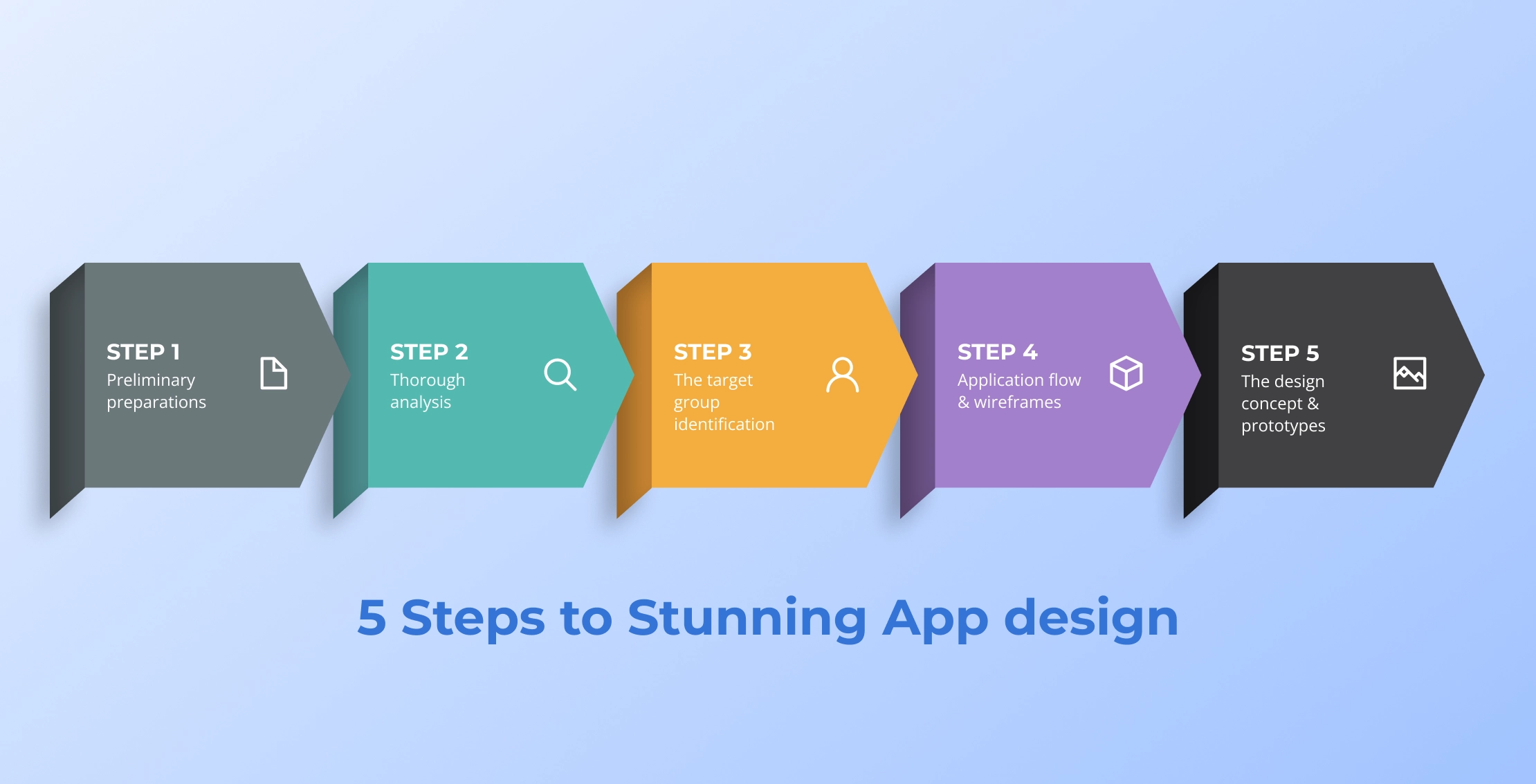
1. Define the task and constraints
Write down who the app is for, the problem it solves and the first result a user should achieve. Agree the platform, required integrations and release boundary. Replace “make it intuitive” with something observable, such as completing an appointment booking without help.
Give the team one decision owner and a clear place to record unresolved questions. If the first release is still too broad, use the MVP scoping guide to separate the core task from features that can wait.
2. Research the problem and alternatives
Speak to people who face the problem and observe their current workaround where possible. Reviews of competing products can reveal questions to investigate, but they do not replace evidence from your own intended users. Record what is known, what is assumed and what could change the design decision.
Compare familiar patterns as well as competitors. A calendar, checkout or document upload may already have conventions users understand. Keep those conventions unless a specific requirement gives you a reason to change them.
3. Identify users and their context
Describe the people completing the task, their knowledge and their access needs. Useful distinctions include occasional versus daily use, a shared versus personal device, and a quiet office versus an interrupted working environment. Avoid collecting demographic details that do not change a design decision.
For a hypothetical booking app, a returning customer might need a quick repeat appointment, while a first-time visitor needs enough service information to choose confidently. Those are different starting points within the same product, not a reason to build two unrelated interfaces.
4. Map the flow and sketch wireframes
Draw the route from the starting point to a confirmed outcome. Include sign-in, permissions, loading, empty results, errors and cancellation. Decide what information must survive if the person moves backwards or leaves the flow temporarily.
Use low-detail wireframes to test the order of decisions before discussing colours. In the booking example, show how a person changes the service or date without losing everything already entered. Remove unnecessary choices, but keep explanations that help users make a sound decision.
5. Build and test a prototype
Create a clickable prototype with realistic labels and enough content to make the main journey believable. Ask intended users to attempt a task without being shown the answer. Note where they hesitate, misunderstand feedback or need assistance; then revise the flow and test the changed part.
For teams using Figma for app design, put the key screens in frames, connect the intended interactions and set a clear flow starting point. Include error and return paths before sharing the prototype for testing. Figma’s official prototyping guide explains the frame-and-flow setup; a clickable prototype does not by itself implement the app.
Before development, agree the component states, responsive behaviour and acceptance checks. The handoff should explain how the interface behaves, including failure and recovery, rather than leaving developers to infer the product rules from screenshots.
Use a short acceptance note for each critical interaction. Record the starting state, the action, the expected result and the recovery route. For example, a failed booking should explain whether the slot was lost, whether payment was taken and how the person can try again.
- Can the person identify the next action without an explanation?
- Does the interface preserve information after a recoverable error?
- Can keyboard and assistive-technology users reach the same outcome?
App design principles that hold up beyond a trend
The most useful mobile app design best practices support the task across screens and states. Review them together: a clear visual hierarchy cannot compensate for an action that produces no understandable feedback.
Give colour a consistent purpose
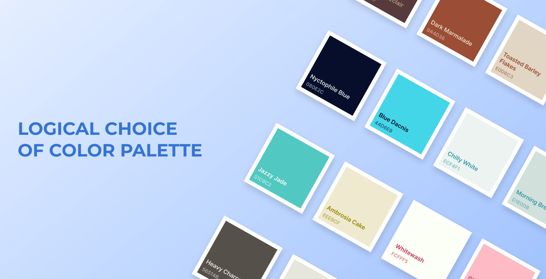
Assign colours to roles such as primary action, error, background and secondary information. Check the combinations in light and dark appearances where supported. A fashionable accent is optional; distinguishable text, controls and states are essential. Do not use colour alone to communicate an error or selection.
Make the layout adapt
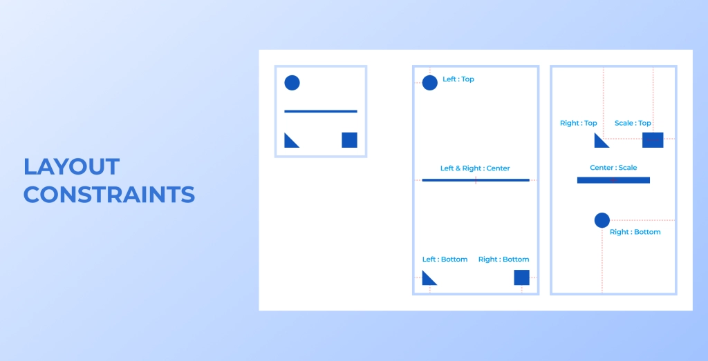
Define alignment, spacing and resizing rules for components. Give essential content enough room and use progressive disclosure when secondary details would overwhelm the screen. Test long names, translated labels, an open keyboard and larger text settings, not just the shortest sample content.
Use readable type and a clear hierarchy

Give headings, body text, labels and supporting information distinct roles. Keep essential instructions readable at the point of action. Review wrapping and line spacing with real content and accessibility settings. A decorative typeface should not make a form, price or confirmation harder to understand.
Use contrast to explain priority
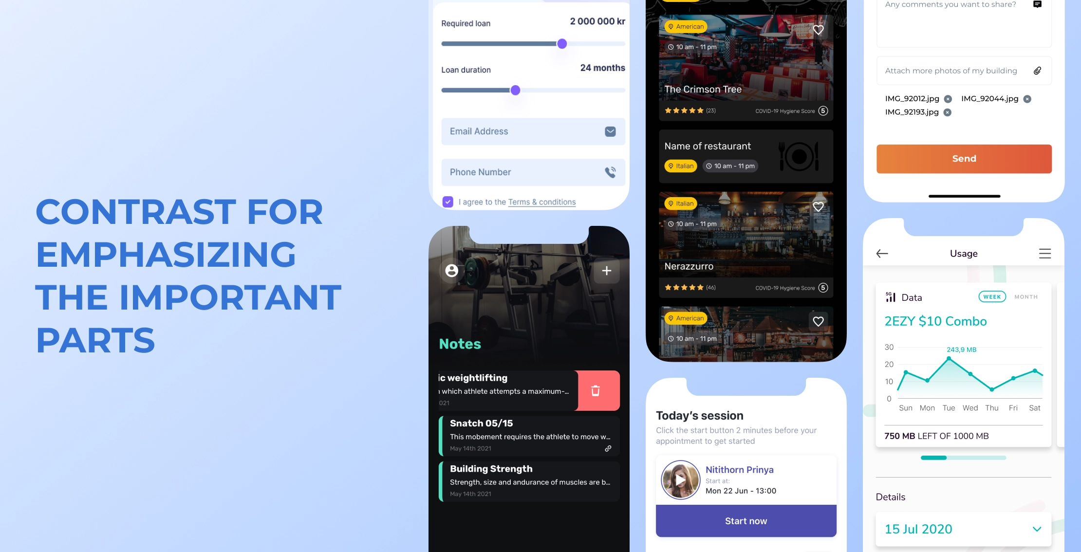
Make the primary action easy to identify without turning every element into a competing highlight. Check text and control contrast against the applicable accessibility requirements. Distinguish selected, disabled, loading and error states through more than a subtle shade change.
Keep navigation predictable
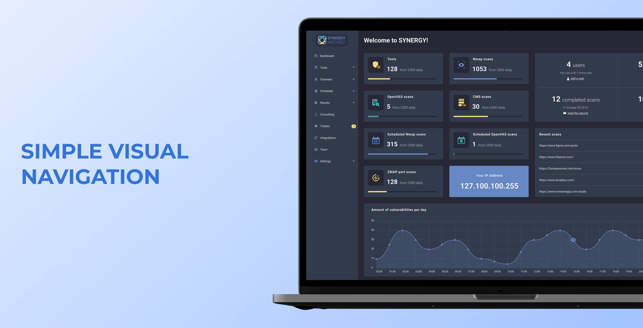
Use names people understand and keep the same destination labelled consistently. Make the current location and the route back clear. Test whether a new user can find the core task from the normal entry point, not only from the screen the designer happens to have open.
Make icons and motion explain the interface

Use familiar icons and add visible labels when meaning is uncertain. Keep their weight and treatment consistent. Motion can explain a transition or confirm an action, but it should not delay the task or carry information that disappears before someone can read it. Respect reduced-motion preferences.

Use design systems without copying every screen
A design system gives the team shared components, visual rules and interaction patterns. Material Design 3 provides a foundation for Android-style interfaces; its official Compose implementation guidance explains theming, typography and components. Apple’s Human Interface Guidelines help teams design experiences that fit Apple platforms.
Start with the relevant platform’s familiar controls, navigation and accessibility behaviour. Customise colour, typography, content and distinctive product interactions where they support a real requirement. Avoid replacing a familiar pattern merely to make the app look different. Apple’s design principles make familiarity, flexibility and user agency useful decision checks.
A small team does not need to invent a large component library before its first release. Document the components used in the main flow, their states and the decisions that should stay consistent. Expand the system as repeated product needs emerge.
For Android app design, keep components and navigation behaviour consistent with the platform, then test the task across window sizes and accessibility settings. For iPhone, check safe areas, larger text and standard navigation against Apple’s guidance instead of copying an Android screen unchanged.
Know what is ready for development
Before approving the design, check that the main journey works with realistic content, errors have recovery routes, and the team can explain the responsive and accessibility behaviour. Keep open product questions separate from approved interface decisions. For a wider product review, see 9 Things That Compose a Good App.
Powercode Group’s UI/UX and product-design service can support the design work. If you need help, send us the core user journey, target platforms and current prototype so we can discuss the scope.
Frequently asked questions
What is app design?
App design defines how an application looks and behaves: its user flows, screens, controls, content and feedback. It combines interface decisions with the wider experience of completing a task.
How do you design apps?
Define the user and core task, research the problem, map the flow, sketch wireframes and test a clickable prototype. Agree the main states and acceptance checks before development, then improve the design using observed feedback.
How do you use Figma to design an app?
Create frames for the key screens, connect the interactions and choose a flow starting point. Preview the journey, test it with realistic tasks and revise confusing paths. Document the component states the development team will need.
How do you design an app for iPhone?
Start with the user journey and Apple’s Human Interface Guidelines. Use familiar navigation, respect safe areas and test larger text and accessibility settings. Customise the visual style without making standard actions harder to understand.
How do you design an Android app?
Use the Material design system as a starting point for components, navigation and visual states. Adapt the layout to available space, test accessibility and recovery paths, and agree the behaviour before implementing screens.